

Piet Mondrian: Turning a bike into a work of art
Piet Mondrian, was one of the founders of the Dutch modern movement De Stijl, and has had an outsized influence on the bike world for at least the last 40 years. Most people will reference the La Vie Claire professional racing team of the mid 80’s as the start of Cycling’s infatuation with Mondrian’s work.
Following La Vie Claire, French bicycle manufacturer, Look incorporated Mondrian’s designs into their logo and a number of paint schemes throughout the years. And ever since cycling has had a love affair with the simple colors and designs Mondrian used in his works.
It was with this basic knowledge of the designs that inspired me to create a Mondrian paint job for my personal bike. My first attempt was back in 2020 and was planned for the North American Hand Made Bike show that spring. At the time in my career as a painter I felt I was starting to really get the hang of some techniques and I wanted to enter a show and really push my skills. This turned out to be a massive undertaking. Many of the previous Mondrian inspired bicycle paint jobs I had seen were limited in their scope. They used limited real estate on the bike, keeping the design to just the straight tubes or small clusters on the frame. I endeavored to cover the entire frame in the iconic designs. This first attempt took well over 100 hours to complete and while at the time I was happy enough with the work. Over the last few years, I began seeing the limitations of my skill at the time and wished I had made different decisions when it came to some of the design elements.
As I used my own personal bike, a BH G7, as my canvas, when NAHBS was canceled for 2020 and beyond, I began riding it for training and racing over the next 3 years. This of course led to normal wear and tear, be it chips or scratches and after the 2023 racing season finished I decided it was time for an update.
Like all of our paint jobs, I had to start by removing all of the old paint. For this bike that actually meant removing 2 paint jobs. Back in 2020 I was so rushed to complete 3 paint jobs for the NAHBS that I did not entirely strip the bikes I was painting, instead I just scuffed the original paint. They were all my personal bikes and decided it was okay in order to get them done in time. This meant I was carrying around at least 1/2 a pound of extra paint on this bike, and as someone who goes uphill slowly, every gram counts!


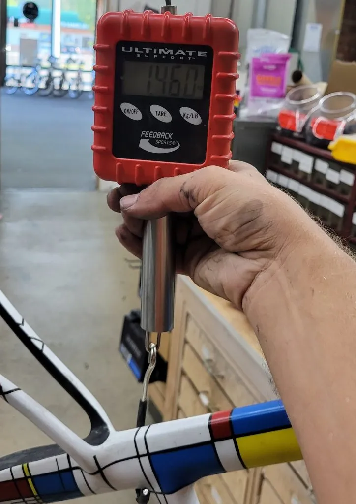
With all of the paint on the frame and fork I was at 1.46 kilograms.
Once the paint was all removed I wanted to make some edits to the frame as things like cable holes in the down tube and cable access holes under the bottom bracket were not needed anymore and I thought filling them in would create a cleaner look.


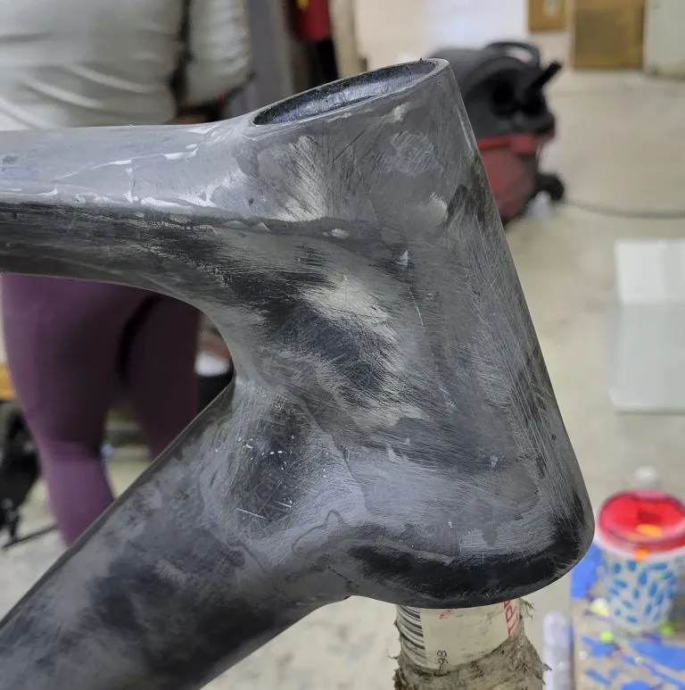
With the paint removed and those holes filled in my frame and fork was sitting at 1.26 kilograms. 200 grams of paint had been removed!
The process of removing paint can be a bit of a rough on the frame and requires multiple steps of primer and filler to get the frame to a point it is ready for the base paint colors. Between each session of spraying primer I would sand the entire frame again with 400 grit sandpaper to smooth out any sanding marks or gouges created when stripping the original paint.
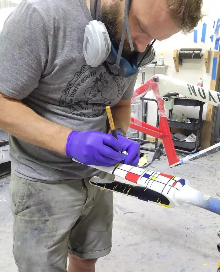
Once the frame was perfectly smooth it was time to start masking. The black lines are the first color for the Mondrian design and I would need to mask off all the black lines first. I was able to use the same line design I used for the first version. It takes over 10 feet of vinyl to print out both sides of the line masking. Once my plotter had them cut out I had to spend a day or so weeding the prepping the masks. I also had a printout that showed where each mask went so that they all lined up as close as possible.


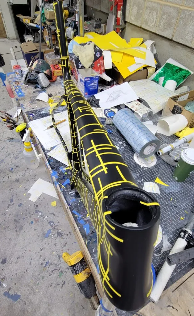
Once the black color masking (all the lines in yellow) had been applied it was time to paint the colored squares. In order to not add crazy amounts of paint for each color and then have deep paint lines I used a colored primer and then the base color. So I used a blue primer which has a much higher pigment saturation and then used a blue base on top of that which made for a thinner layer of paint than if I had just used a colored base alone. Once I finished with the blue I would mask those shapes off and go on to the red and then the yellow repeating the same process used on the blue shapes.


The most important thing in this part was to make sure these color blocks had an even smooth look and didn’t have a splotchy application.
Next came the best part, the white layer is the part of the process that would really start to bring the whole design together. Before the white it is hard to see the big picture and is easy to second guess if the design will pan out.


Next we come to the point of great stress! The removal of all that masking. It is stressful because there are so many things that could have gone wrong in the lead up to this point. You wouldn’t know it though until you remove all the tape that has been added over the last few days and weeks. Happily this process was very painless this time around. The masking came off and there were only minor touch ups that were required. A big win for a project that is so complex.
Next I moved on to the head badge. BH is a very old family company. It was started in the early 1900s and originally was a gun manufacturer. However after World War 1 the family swore off guns and began creating bicycles. Today the official logo of BH is a pretty bland BH that really doesn’t do a whole lot for me. A number of years ago I was involved with BH North America in doing warranty repairs and what not. At that time the current head of North American bike operations named Greg Ford showed me the family crest of BH and was in the process of using it in the USA for branding purposes. I though this was pretty amazing and started using it on my own bikes, (I owned 2 at the time) or any BH frames that I painted for customers. For the Mondrian frame I took it another step and painted a multi color design. It is one of the more complicated masking jobs I have done, but in the end it looks so great. Makes me wish my family had a crest.
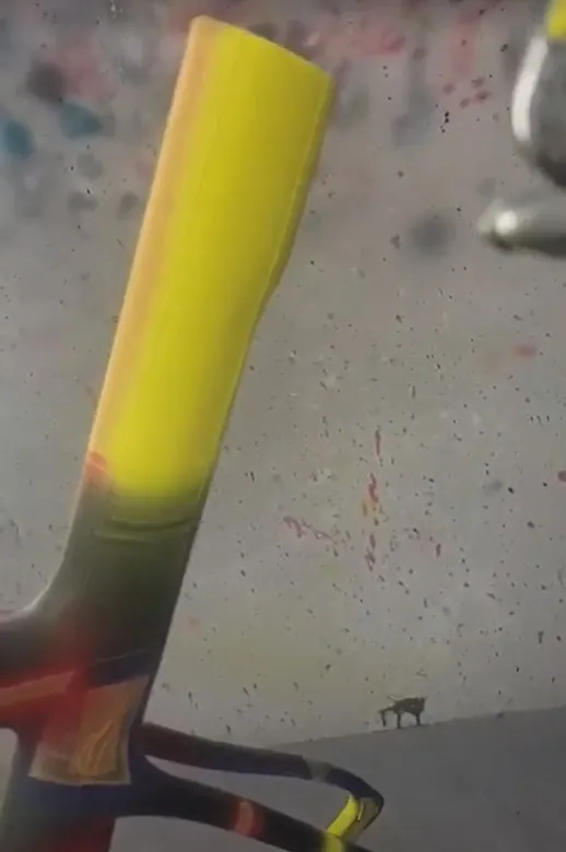
The last step was to add the down tube logo. In my first version I tried to do a very subtle matte clear down tube logo. But it really didn’t work how I wanted, it was basically invisible unless you got up really close and looked at it in the right light. That lead most people to believe my frame was some open mold generic road frame. This time I went with a black candy. I wanted something that would be slightly transparent so you could still see the design below the logo if you looked closely but you would also easily see what brand the bike was.
With all of the base colors and designs done it was off to the clear coat booth. In order to create a perfectly smooth paint job we use whats called a high solid clear. This clear gives you a thick finish so you have more real estate to sand and level out all of the paint. For this paint job this actually took 2 rounds of painting and sanding. While I had planned it out well to not have crazy thick paint lines, they were still thick enough and numerous enough that I needed more clear than a typical paint job.
The trick to flattening out paint is that you don’t want to sand through the clear coat into your base paint. That would mean you would have to mask off areas and repaint the spots you sanded through with new base paint, and that could also mean more paint lines that you would have to again, sand down. This is something that is always a guessing game. You are playing chicken with your work trying to decide if you have more clear to spare or if you need add more paint on top. This may sound like you are just piling on paint and weight, but remember you are sanding down the high spot to just leave a slightly thicker low spot.
When the paint was as smooth as it was going to get it was time to add my final coat of paint. For this version I went with a matte clear. The reason for this was I wanted the paint job to look more like a canvas than a shiny bicycle. Matte is not my favorite when it comes to finishes. You have much less room for error and once you scratch it, there is no fixing it without more painting. It can also be tough to keep clean. Where a gloss finish you can polish defects and dirt has an easier time coming off. But in the end gloss and matte clear are the same product with matte just having a matting agent added to it.
In the end my frame and fork came out lighter than it had started by 90 grams!
I hope that this version of my Mondrian paint job will last longer than the last. In the Midwest my bike has become a bit of a known entity and people know me because of it. The pride that I get from being able to pull of this technically challenging paint job makes all the hard work worth it. Often people proclaim that bikes I paint are too pretty to ride, but I paint bikes to be ridden. I know that this will get scratched and dinged and maybe even broken one day. But I don’t want to hide away my work, I want people to see it. I create art on bikes and I want the world to know about it.